Neutral Palette
The design system uses cool neutral grays – also referred to as “slates” – to establish a modern interface more attractive than an array of default grays. Use neutrals sparingly beyond essentials of text and background color, and avoid conveying many levels of hierarchy in many neutral tones.
The following neutral tones have been deprecated and will not be supported moving forward.
Theming Palettes
All theme colors are named aliases for specific values within the expanded color palette.
Platform Blue
Use blue (also referred to as the default "platform" theme color) to afford interactivity in primary interactions like buttons, tabs, and links. You can also alter the interactive color to a product theme (see below).
Platform Purple (Visited)
Use this purple (also referred to as the default "visited" color) to afford previously visited locations in primary interactions like buttons, tabs, and links.
Product Themes
Product theme colors are used to accent an individual product as distinct from the “platform” use of the interactive blue.. For example, Techbook products use custom green, orange, and purple hues for science, social studies, and math respectively. This accent color is primarily used to replace primary interactions and affordances. For more information, refer to Theming guidelines.
Science
Apply a green accent for the Techbook Science product.
Social Studies
Apply an orange accent for the Techbook Social Studies product.
Math
Apply a purple accent for the Techbook Math product.
STEM
Apply an aqua accent for the STEM product.
Coding, Comet
Apply alternative blue accents for the Coding and Comet products.
Espresso
Apply a purple accent for the Espresso product.
Health and Relationships
Apply a plum accent for the Health and Relationships product.
UK Secondary
Apply a plum accent for the UK Secondary product.
Pathway
Apply a gold accent for the Pathway product.
Additional Themes
Contact the system team to establish additional themes for your products. During this process, we’ll work with you to identify a primary color harmonious with the primary palette, expand to dark and light variants, and apply it throughout your experience.
Expanded Palette
The expanded palette is a group of colors that are not tied to a single product but are part of the growing list of colors available for use in the comet library. These colors are free to use but should be critically evaluated for the benefit of their use within a design or product.
Azure
Emerald
Midnight
Orchid
Plum
Violet
Lime
Tangerine
Teal
Red
Green
Yellow
Orange
Surf
Goldenron
Feedback Palette
Use feedback colors to draw attention to an error, success, warning or other notable state. For more information, refer to Feedback guidelines.
All feelback colors are named aliases for specific values in the expanded color palette.
Success
Error
Warning
New
TEI Feedback
Badges
Assignment Palette
Background Color
The Comet system offers four common neutral background colors to create a predictable setting to compose a user interface with accessible, consistent appearance.
Neutral Backgrounds
-
Use as the default canvas of main content and long form text.
-
Use to establish subtle contrast with a main content block, such as a right rail block or TEI within the flow of a Techbook concept.
-
Use in low light settings, in canvases to create stark contrast or focus on an object, or to signal separate, distinct content in a new row of a scrolling page.
-
Use sparingly, such as for lightbox or backdrop for photographs and videos like the Player/Asset page. In most cases, prefer the cooler Dark Gray for background contrast relative to Cool Gray and White.
Themed Backgrounds
Avoid using themed colors as a background color, instead reserving such colors for accents and interactions. Nevertheless, there may be rare occasions such as a full canvas, large message, or full-bleed row where such displays may be warranted.
-
Use platform blue sparingly as a background color, since it's reserved mainly for accents and interactive elements.
-
Example use of Social Studies product theme default color as a background.
When using a theme color as a background:
- Always get approval for using a new theme color not already provided by the Comet design system.
- In most cases, treat the theme color as a dark background, using light text (and white for links and inline error messages).
- Ensure all text results in at least AA scored accessible contrast.
- Use white as an alternate to the theme color’s use for primary interactions and accents.
Block Color Layering
As component displays become more complex, individual objects may use a background color distinct from a row or canvas background color. Such block colors are useful for distinguish an interaction, module (such as blocks on a right rail), and a collection of items (such as a grid of cards).
Examples: Buttons
Many icon buttons predictably can use a platform blue background color as a primary button or have a flat button appearance. However, secondary and tertiary buttons utilize the light and dark block colors, and swap their appearance in dark setting appropriately. For example, while dark by default, secondary buttons become light in dark settings.
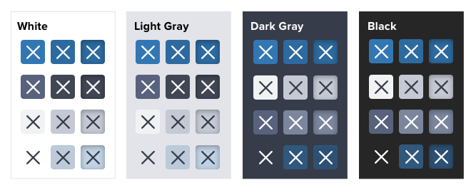 Figure: Buttons across backgrounds
Example: Cards
The Card component offers both a light and dark background color for the content area containing the object’s title, description, and type. Therefore, no matter the setting, both variations achieve the subtle or stark contrast for each application. Note the exception for light cards on light backgrounds, using a white card content background.
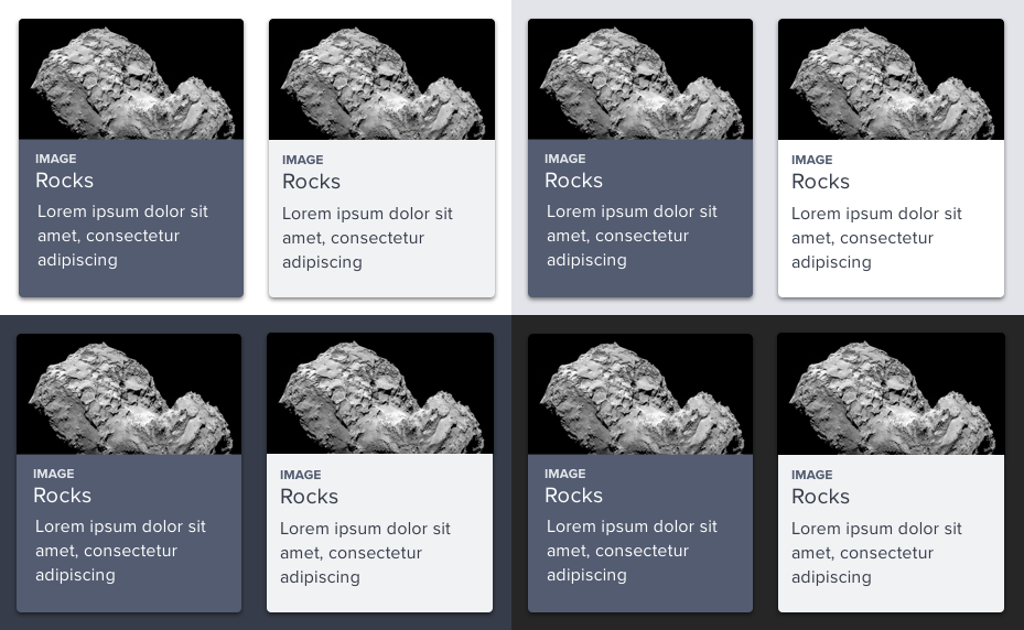 Figure: Cards across backgrounds
Input Controls
All form input objects – textbox, text area, radio button, checkbox, and other similar controls – use a white background surrounded by a conventional light gray border, regardless of background. This guarantees a predictable contrast and easy to acquire fields, despite their sometimes less “elegant and cool” appearance.
-
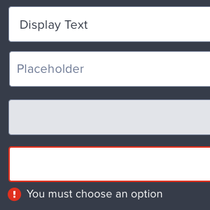
use standard background colors for input controls (such as a default textbox) as defined for forms, even in dark color backgrounds.
-
alter default background colors to create a “ghost” effect, even above a predictable background color or photo. This reduces findability and impedes usability.
Refer to variables in the form.styl file for specific text, foreground, and border colors used in forms.
Text Color
The Comet system offers an optimized, accessible system for applying color to text across varied settings. These conventions are woven into Comet components and should be used when applying color to custom designs.
Dark Text on Light Backgrounds
| Role | Color | Token |
|---|---|---|
| Primary, essential text | #363C49 |
$comet-text-color-primary-on-light
|
| Secondary, supporting text | #58627D |
$comet-text-color-secondary-on-light
|
| Interactive, linked text | #2D6A9F |
$comet-text-color-link-on-light
|
| Inline error text | #B42818 |
$comet-text-color-error-on-light
|
| Disabled text | #98A1B3 |
$comet-text-color-disabled
|
Light Text on Dark Backgrounds
| Role | Color | Token |
|---|---|---|
| Primary, essential text | #FFFFFF |
$comet-text-color-primary-on-dark
|
| Secondary, supporting text | #C4C9D4 |
$comet-text-color-secondary-on-dark
|
| Interactive, linked text | #FFFFFF |
$comet-text-color-link-on-dark
|
| Inline error text | #FFFFFF |
$comet-text-color-error-on-dark
|
| Disabled text | #98A1B3 |
$comet-text-color-disabled
|
- Never use “Platform Blue” links on dark backgrounds, which offers very poor, inaccessible contrast.
- Never use “Feedback Red” color for inline error text on dark backgrounds, which offers very poor, inaccessible contrast.
Border Color
Hairlines
Hairline borders are used to separate objects in collections.
| Usage | Color | Token |
|---|---|---|
|
On light backgrounds |
#C4C9D4 |
$comet-border-hairline-on-light
|
|
On dark backgrounds |
#58627d |
$comet-border-hairline-on-dark
|
- Use hairlines very sparingly, usually to divide items in a vertical collection such as a list group or rows of a data table.
- Avoid littering the interface with thin rules. Instead, favor whitespace to create contrast and separation between elements and components.
- Avoid drawing a hairline around objects except when even a shadow is insufficient (typically, a white block on a white background).
- Never use hairlines to separate passages of text or above/below headings. Use whitespace instead.
Contrast & Accessibility
Comet aims to meet WCAG standards for color contrast for all essential content, which is 4.5:1 for normal text and 3:1 for bold or larger text.
| Score | Contrast Ratio | Result |
|---|---|---|
| AAA | 7.0+:1 | Passes WCAG 2.0 AAA |
| AA | 4.5+:1 | Passes WCAG 2.0 AA |
| AA18 | 3.0+:1 | Passes WCAG 2.0 AA Large Text Only (18pt or 14pt bold) |
| DNP | <3.0 | DNP |
The following table contrasts neutral background colors (as rows) with foreground type colors (as columns), revealing combinations that don't pass or pass at varying levels.
| W | 100 | 95 | 90 | 80 | 70 | 65 | 60 | 55 | 50 | 42 | 40 | 38 | 32 | 30 | 25 | 20 | 15 | 10 | 5 | B | ||
| Background | Foreground | |||||||||||||||||||||
| B |
DNP
21
|
DNP
21
|
DNP
21
|
DNP
21
|
DNP
21
|
DNP
21
|
DNP
21
|
DNP
21
|
DNP
21
|
DNP
21
|
DNP
21
|
DNP
21
|
DNP
21
|
DNP
21
|
DNP
21
|
DNP
21
|
DNP
21
|
DNP
21
|
DNP
21
|
|||
| 5 |
DNP
21
|
DNP
21
|
DNP
21
|
DNP
21
|
DNP
21
|
DNP
21
|
DNP
21
|
DNP
21
|
DNP
21
|
DNP
21
|
DNP
21
|
DNP
21
|
DNP
21
|
DNP
21
|
DNP
21
|
DNP
21
|
DNP
21
|
DNP
21
|
DNP
21
|
|||
| 10 |
DNP
21
|
DNP
21
|
DNP
21
|
DNP
21
|
DNP
21
|
DNP
21
|
DNP
21
|
DNP
21
|
DNP
21
|
DNP
21
|
DNP
21
|
DNP
21
|
DNP
21
|
DNP
21
|
DNP
21
|
DNP
21
|
DNP
21
|
DNP
21
|
DNP
21
|
DNP
21
|
||
| 15 |
DNP
21
|
DNP
21
|
DNP
21
|
DNP
21
|
DNP
21
|
DNP
21
|
DNP
21
|
DNP
21
|
DNP
21
|
DNP
21
|
DNP
21
|
DNP
21
|
DNP
21
|
DNP
21
|
DNP
21
|
DNP
21
|
DNP
21
|
DNP
21
|
DNP
21
|
DNP
21
|
||
| 20 |
DNP
21
|
DNP
21
|
DNP
21
|
DNP
21
|
DNP
21
|
DNP
21
|
DNP
21
|
DNP
21
|
DNP
21
|
DNP
21
|
DNP
21
|
DNP
21
|
DNP
21
|
DNP
21
|
DNP
21
|
DNP
21
|
DNP
21
|
DNP
21
|
DNP
21
|
DNP
21
|
||
| 25 |
DNP
21
|
DNP
21
|
DNP
21
|
DNP
21
|
DNP
21
|
DNP
21
|
DNP
21
|
DNP
21
|
DNP
21
|
DNP
21
|
DNP
21
|
DNP
21
|
DNP
21
|
DNP
21
|
DNP
21
|
DNP
21
|
DNP
21
|
DNP
21
|
DNP
21
|
DNP
21
|
||
| 30 |
DNP
21
|
DNP
21
|
DNP
21
|
DNP
21
|
DNP
21
|
DNP
21
|
DNP
21
|
DNP
21
|
DNP
21
|
DNP
21
|
DNP
21
|
DNP
21
|
DNP
21
|
DNP
21
|
DNP
21
|
DNP
21
|
DNP
21
|
DNP
21
|
DNP
21
|
DNP
21
|
||
| 32 |
DNP
21
|
DNP
21
|
DNP
21
|
DNP
21
|
DNP
21
|
DNP
21
|
DNP
21
|
DNP
21
|
DNP
21
|
DNP
21
|
DNP
21
|
DNP
21
|
DNP
21
|
DNP
21
|
DNP
21
|
DNP
21
|
DNP
21
|
DNP
21
|
DNP
21
|
DNP
21
|
||
| 38 |
DNP
21
|
DNP
21
|
DNP
21
|
DNP
21
|
DNP
21
|
DNP
21
|
DNP
21
|
DNP
21
|
DNP
21
|
DNP
21
|
DNP
21
|
DNP
21
|
DNP
21
|
DNP
21
|
DNP
21
|
DNP
21
|
DNP
21
|
DNP
21
|
DNP
21
|
DNP
21
|
||
| 40 |
DNP
21
|
DNP
21
|
DNP
21
|
DNP
21
|
DNP
21
|
DNP
21
|
DNP
21
|
DNP
21
|
DNP
21
|
DNP
21
|
DNP
21
|
DNP
21
|
DNP
21
|
DNP
21
|
DNP
21
|
DNP
21
|
DNP
21
|
DNP
21
|
DNP
21
|
DNP
21
|
||
| 42 |
DNP
21
|
DNP
21
|
DNP
21
|
DNP
21
|
DNP
21
|
DNP
21
|
DNP
21
|
DNP
21
|
DNP
21
|
DNP
21
|
DNP
21
|
DNP
21
|
DNP
21
|
DNP
21
|
DNP
21
|
DNP
21
|
DNP
21
|
DNP
21
|
DNP
21
|
DNP
21
|
||
| 50 |
DNP
21
|
DNP
21
|
DNP
21
|
DNP
21
|
DNP
21
|
DNP
21
|
DNP
21
|
DNP
21
|
DNP
21
|
DNP
21
|
DNP
21
|
DNP
21
|
DNP
21
|
DNP
21
|
DNP
21
|
DNP
21
|
DNP
21
|
DNP
21
|
DNP
21
|
DNP
21
|
||
| 55 |
DNP
21
|
DNP
21
|
DNP
21
|
DNP
21
|
DNP
21
|
DNP
21
|
DNP
21
|
DNP
21
|
DNP
21
|
DNP
21
|
DNP
21
|
DNP
21
|
DNP
21
|
DNP
21
|
DNP
21
|
DNP
21
|
DNP
21
|
DNP
21
|
DNP
21
|
DNP
21
|
||
| 60 |
DNP
21
|
DNP
21
|
DNP
21
|
DNP
21
|
DNP
21
|
DNP
21
|
DNP
21
|
DNP
21
|
DNP
21
|
DNP
21
|
DNP
21
|
DNP
21
|
DNP
21
|
DNP
21
|
DNP
21
|
DNP
21
|
DNP
21
|
DNP
21
|
DNP
21
|
DNP
21
|
||
| 65 |
DNP
21
|
DNP
21
|
DNP
21
|
DNP
21
|
DNP
21
|
DNP
21
|
DNP
21
|
DNP
21
|
DNP
21
|
DNP
21
|
DNP
21
|
DNP
21
|
DNP
21
|
DNP
21
|
DNP
21
|
DNP
21
|
DNP
21
|
DNP
21
|
DNP
21
|
DNP
21
|
||
| 70 |
DNP
21
|
DNP
21
|
DNP
21
|
DNP
21
|
DNP
21
|
DNP
21
|
DNP
21
|
DNP
21
|
DNP
21
|
DNP
21
|
DNP
21
|
DNP
21
|
DNP
21
|
DNP
21
|
DNP
21
|
DNP
21
|
DNP
21
|
DNP
21
|
DNP
21
|
DNP
21
|
||
| 80 |
DNP
21
|
DNP
21
|
DNP
21
|
DNP
21
|
DNP
21
|
DNP
21
|
DNP
21
|
DNP
21
|
DNP
21
|
DNP
21
|
DNP
21
|
DNP
21
|
DNP
21
|
DNP
21
|
DNP
21
|
DNP
21
|
DNP
21
|
DNP
21
|
DNP
21
|
DNP
21
|
||
| 90 |
DNP
21
|
DNP
21
|
DNP
21
|
DNP
21
|
DNP
21
|
DNP
21
|
DNP
21
|
DNP
21
|
DNP
21
|
DNP
21
|
DNP
21
|
DNP
21
|
DNP
21
|
DNP
21
|
DNP
21
|
DNP
21
|
DNP
21
|
DNP
21
|
DNP
21
|
DNP
21
|
||
| 95 |
DNP
21
|
DNP
21
|
DNP
21
|
DNP
21
|
DNP
21
|
DNP
21
|
DNP
21
|
DNP
21
|
DNP
21
|
DNP
21
|
DNP
21
|
DNP
21
|
DNP
21
|
DNP
21
|
DNP
21
|
DNP
21
|
DNP
21
|
DNP
21
|
DNP
21
|
DNP
21
|
||
| 100 |
DNP
21
|
DNP
21
|
DNP
21
|
DNP
21
|
DNP
21
|
DNP
21
|
DNP
21
|
DNP
21
|
DNP
21
|
DNP
21
|
DNP
21
|
DNP
21
|
DNP
21
|
DNP
21
|
DNP
21
|
DNP
21
|
DNP
21
|
DNP
21
|
DNP
21
|
|||
| W |
DNP
21
|
DNP
21
|
DNP
21
|
DNP
21
|
DNP
21
|
DNP
21
|
DNP
21
|
DNP
21
|
DNP
21
|
DNP
21
|
DNP
21
|
DNP
21
|
DNP
21
|
DNP
21
|
DNP
21
|
DNP
21
|
DNP
21
|
DNP
21
|
DNP
21
|
|||