Default
Promote new features in the service or inform users of changes in the experience with the default Top Hat.
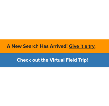
We have a new search waiting for you!
<div class="comet-top-hat " role="alert">
    <div class="comet-top-hat__content">
        <p>We have a new search waiting for you!</p>
    </div>
</div>
{{ comet.top_hat(content="We have a new search waiting for you!") }}

Macro params reference
Warning
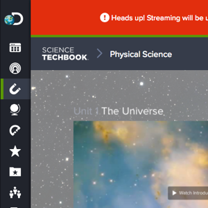
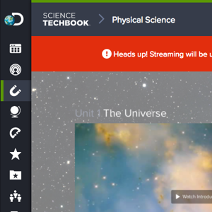
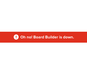
Inform users of downtime or service interruptions with the Warning Tophat.
Heads up! Streaming will be undergoing maintenance on September 1st, 2016.
<div class="comet-top-hat comet-top-hat--notice" role="alert">
    <div class="comet-top-hat__content">
        <svg class="comet-top-hat__icon" aria-hidden="true" focusable="false">
            <use xlink:href="/comet/comet_assets/comet.svg#message-error"></use>
        </svg>
        <p>Heads up! Streaming will be undergoing maintenance on September 1st, 2016.</p>
    </div>
</div>
{{ comet.top_hat(notice=true, content="Heads up! Streaming will be undergoing maintenance on September 1st, 2016.") }}

Macro params reference
Custom Color
Apply a custom color for messages associated with a specific brand or product identity.
An exciting new STEM platform is coming to Discovery Education.
Learn More<div class="comet-top-hat comet-top-hat--custom" role="alert" style="background:#4C1787;">
<div class="comet-top-hat__content">
<p>An exciting new STEM platform is coming to Discovery Education.</p>
<a class="comet-button comet-button--ghost comet-button--small comet-button--on-dark" role="button" href="#">
Learn More
</a>
</div>
</div>
{{ comet.top_hat(content="An exciting new STEM platform  is coming to Discovery Education.", cta_text="Learn More", custom_background_color="#4C1787") }}

Macro params reference
Dismissible
Enable users to dismiss a Top Hat.
We’d love to hear from you! Care to take a survey?
Take Survey<div class="comet-top-hat " role="alert">
<div class="comet-top-hat__content">
<p>We’d love to hear from you! Care to take a survey?</p>
<a class="comet-button comet-button--secondary comet-button--small" role="button" href="#">
Take Survey
</a>
</div>
<div class="comet-top-hat__close">
<button type="button" class="comet-top-hat__close-button js-comet-top-hat__close-button" aria-label="Close">
<svg class="comet-top-hat__icon comet-top-hat__icon--close" aria-hidden="true" focusable="false">
<use xlink:href="/comet/comet_assets/comet.svg#x"></use>
</svg>
</button>
</div>
</div>
{{ comet.top_hat(dismissible=true, cta_text="Take Survey", content="We’d love to hear from you! Care to take a survey?") }}

Macro params reference
With Button
Include a button to direct a user to take further action.
We have a new search waiting for you!
Take Survey<div class="comet-top-hat " role="alert">
<div class="comet-top-hat__content">
<p>We have a new search waiting for you!</p>
<a class="comet-button comet-button--secondary comet-button--small" role="button" href="http://www.google.com">
Take Survey
</a>
</div>
</div>
{{ comet.top_hat(content="We have a new search waiting for you!", cta_text="Take Survey", cta_link="http://www.google.com") }}

Macro params reference
Placement
Place the tophat above the product bar, inside .comet-page-shell__product-well-inner. See full page example.
-
place the tophat above the product bar, signaling a global message.
-
place the tophat in the content area, signaling it's product or page specific.
Guidelines
- Use a Top Hat when a message has service-wide implications.
- Never use a Top Hat for messages specific to one page. Instead, use a Block Message below the page title.
- Never stack two or more Top Hats adjacent to one another.
- Display an “x” button to dismiss Top Hat messages, such as notification of uptime/downtime in the service. Avoid using an “x” button for messages that are promoting important changes in design or experience.
-
use a single top hat at the top of the page.
-
use multiple tophats
-
use a top hat to communicate service-wide information.
-
use a top hat for specific user feedback.
Editorial
- Limit Top Hat messages to no more than 100 characters.
- Use friendly conversational language.
- Avoid using language that sounds like a robot or computer speaking.
- Avoid content such as lists or long form text that wraps a Top Hat message in wide viewports.
Class Reference
| Class | Applies to | Outcome |
|---|---|---|
|
|
|
Initializes an element to contain base top hat styles. Must be paired with a variation. |
|
|
|
Displays a notice top hat when paired with |
|
|
|
Displays a custom top hat when paired with |
Macro Params Reference
| Param | Default | Values | Description |
|---|---|---|---|
|
cta_link |
|
String |
The location of the link for the button |
|
cta_text |
|
String |
The text to be displayed in the button, button will not display if false |
|
class |
|
String |
Additional classes added to the top hat |
|
content |
|
String |
The content to be displayed in the top hat |
|
custom_background_color |
|
String |
Used to set a custom background color for the tophat |
|
dismissable |
|
Boolean |
Defines whether or not element can be dismissed by user |
|
icon_name |
|
String |
The name of any icon in the library |
|
icon_path |
|
string |
Allows the definition of an icon path for custom icons. |
|
notice |
|
Boolean |
Sets the tophat to use the |
|
text_color_dark |
|
String |
Must be set to true if |