Default
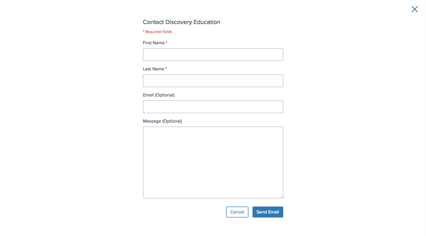
Contact Discovery Education
<div id=modal-default class="comet-modal__inner">
    <div class="comet-modal__header comet-long-form-text">
        <h3 class="comet-modal__header-content">Contact Discovery Education</h3>
    </div>
    <div class="comet-modal__content comet-long-form-text">
        <form class="comet-form" method="post" action="form/processor">
            <span class="comet-form__required-fields-key">Required fields</span>
            <div class="comet-form__field-group">
                <label class="comet-form__label" for="full-form-first-name">
                    First Name<abbr class="comet-form__label-required-indicator" title="This field is required." aria-hidden="true">*</abbr>
                    <span class="comet-screenreader-only">Required Field.</span>
                </label>
                <input class="comet-form__input" type="text" id="full-form-first-name">
            </div>
            <div class="comet-form__field-group">
                <label class="comet-form__label" for="full-form-last-name">
                    Last Name<abbr class="comet-form__label-required-indicator" title="This field is required." aria-hidden="true">*</abbr>
                    <span class="comet-screenreader-only">Required Field.</span>
                </label>
                <input class="comet-form__input" type="text" id="full-form-last-name">
            </div>
            <div class="comet-form__field-group">
                <label class="comet-form__label" for="full-form-email">
                    Email<span class="comet-form__label-optional">
                        (Optional)
                    </span>
                </label>
                <input class="comet-form__input" type="email" id="full-form-email" aria-describedby="full-form-email-help-text">
            </div>
            <div class="comet-form__field-group">
                <label class="comet-form__label" for="full-form-message">
                    Message
                </label>
                <textarea class="comet-form__textarea" id="full-form-message"></textarea>
            </div>
        </form>
    </div>
    <div class="comet-modal__footer">
        <div class="comet-modal__button-row">
            <button class="comet-button comet-button--ghost comet-modal__button comet-modal__button--cancel js-comet-modal__close-button">
                Cancel
            </button>
            <a class="comet-button comet-button--primary comet-modal__button" role="button" href="http://www.google.com">
                Send Email
            </a>
        </div>
    </div>
</div>
{% call comet.modal(
    header="Contact Discovery Education",
    primary_cta_link="http://www.google.com",
    primary_cta_text="Send Email",
    cancel_cta_text="Cancel",
    id="modal-default"
) %}
    {% call comet.form() %}
        {{ comet.form_required_fields_key() }}
        {% call comet.form_field_group() %}
            {{ comet.form_label(text="First Name", required=true, for="full-form-first-name") }}
            {{ comet.form_input(id="full-form-first-name") }}
        {% endcall %}
        {% call comet.form_field_group() %}
            {{ comet.form_label(text="Last Name", required=true, for="full-form-last-name") }}
            {{ comet.form_input(id="full-form-last-name") }}
        {% endcall %}
        {% call comet.form_field_group() %}
            {{ comet.form_label(text="Email", optional=true, for="full-form-email") }}
            {{ comet.form_input(type="email", id="full-form-email", describedby="full-form-email-help-text") }}
        {% endcall %}
        {% call comet.form_field_group() %}
            {{ comet.form_label(text="Message", for="full-form-message") }}
            {{ comet.form_textarea(id="full-form-message") }}
        {% endcall %}
    {% endcall %}
{% endcall %}

Macro params referenceContact Discovery Education
Wide

<div id=modal-wide class="comet-modal__inner comet-modal--wide">
    <div class="comet-modal__header comet-long-form-text">
        <h3 class="comet-modal__header-content">Wide Modal</h3>
    </div>
    <div class="comet-modal__content comet-long-form-text">
        <img src="http://placehold.it/1065x500" alt="">
    </div>
    <div class="comet-modal__footer">
        <div class="comet-modal__button-row">
            <button class="comet-button comet-button--ghost comet-modal__button comet-modal__button--cancel js-comet-modal__close-button">
                Cancel
            </button>
            <a class="comet-button comet-button--primary comet-modal__button" role="button" href="http://www.google.com">
                Primary Action
            </a>
        </div>
    </div>
</div>
{% call comet.modal(
    header="Wide Modal",
    primary_cta_link="http://www.google.com",
    primary_cta_text="Primary Action",
    cancel_cta_text="Cancel",
    id="modal-wide",
    wide=true
) %}
    <img src="http://placehold.it/1065x500" alt="">
{% endcall %}

Macro params referenceWide Modal
Use this variation to present a modal that may contain content up to 1065px in width.
Directional
<div id=modal-directional class="comet-modal__inner comet-modal--directional">
    <div class="comet-modal__header comet-long-form-text">
        <h3 class="comet-modal__header-content">Professional Learning</h3>
    </div>
    <div class="comet-modal__content comet-long-form-text">
        <img src="/images/components/modals/directional_modal_content.png" alt="">
    </div>
    <div class="comet-modal__footer">
        <div class="comet-modal__button-row">
            <button class="comet-button comet-button--ghost comet-modal__button comet-modal__button--cancel js-comet-modal__close-button">
                Previous
            </button>
            <a class="comet-button comet-button--primary comet-modal__button" role="button" href="http://www.google.com">
                Next
            </a>
        </div>
    </div>
</div>
{% call comet.modal(
    header="Professional Learning",
    directional=true,
    primary_cta_link="http://www.google.com",
    primary_cta_text="Next",
    cancel_cta_text="Previous",
    id="modal-directional"
) %}
    <img src="/images/components/modals/directional_modal_content.png" alt="">
{% endcall %}
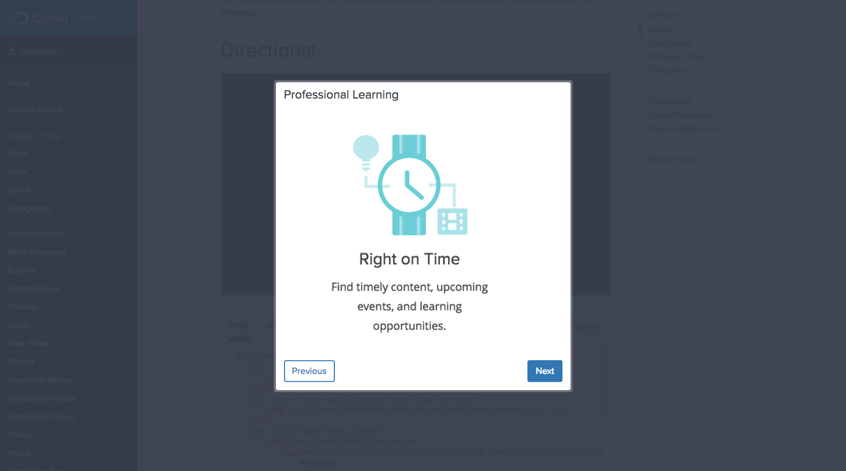
Macro params referenceProfessional Learning

Directional modals are used to present a series of steps or "slides" that have a specific order to them.
Wrapper Only
<div id=modal-wrapper class="comet-modal__inner comet-modal--wide">
    <div class="comet-modal__content comet-long-form-text">
        <img src="/images/components/modals/wrapper_modal_content.png" alt="">
    </div>
    <div class="comet-modal__footer">
        <div class="comet-modal__button-row">
            <button class="comet-button comet-button--primary comet-modal__button">
                Click Me
            </button>
        </div>
    </div>
</div>
{% call comet.modal(
    wide=true,
    id="modal-wrapper"
) %}
    <img src="/images/components/modals/wrapper_modal_content.png" alt="">
{% endcall %}

Macro params reference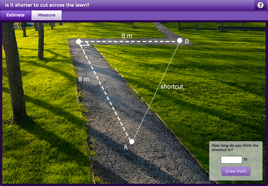
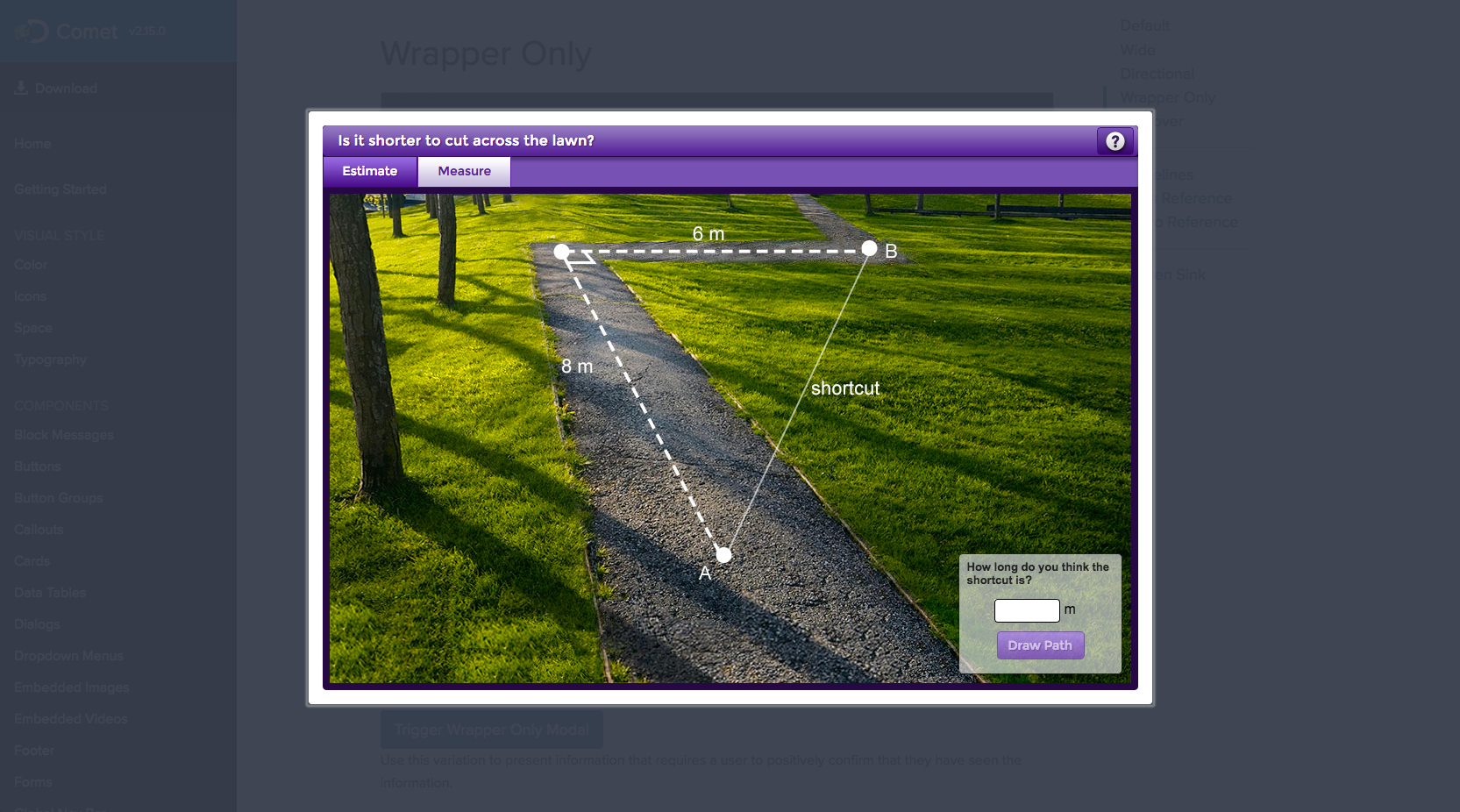
This variation is used to wrap any stand-alone content in a modal.
Wrapper only modals do not provide a close button by default, special consideration should be taken when using this variation.
Takeover
<div id=modal-takeover class="comet-modal__inner comet-modal--takeover">
    <div class="comet-modal__header comet-long-form-text">
        <h3 class="comet-modal__header-content">Contact Discovery Education</h3>
    </div>
    <div class="comet-modal__content comet-long-form-text">
        <form class="comet-form" method="post" action="form/processor">
            <span class="comet-form__required-fields-key">Required fields</span>
            <div class="comet-form__field-group">
                <label class="comet-form__label" for="full-form-first-name">
                    First Name<abbr class="comet-form__label-required-indicator" title="This field is required." aria-hidden="true">*</abbr>
                    <span class="comet-screenreader-only">Required Field.</span>
                </label>
                <input class="comet-form__input" type="text" id="full-form-first-name">
            </div>
            <div class="comet-form__field-group">
                <label class="comet-form__label" for="full-form-last-name">
                    Last Name<abbr class="comet-form__label-required-indicator" title="This field is required." aria-hidden="true">*</abbr>
                    <span class="comet-screenreader-only">Required Field.</span>
                </label>
                <input class="comet-form__input" type="text" id="full-form-last-name">
            </div>
            <div class="comet-form__field-group">
                <label class="comet-form__label" for="full-form-email">
                    Email<span class="comet-form__label-optional">
                        (Optional)
                    </span>
                </label>
                <input class="comet-form__input" type="email" id="full-form-email" aria-describedby="full-form-email-help-text">
            </div>
            <div class="comet-form__field-group">
                <label class="comet-form__label" for="full-form-message">
                    Message<span class="comet-form__label-optional">
                        (Optional)
                    </span>
                </label>
                <textarea class="comet-form__textarea" id="full-form-message"></textarea>
            </div>
        </form>
    </div>
    <div class="comet-modal__footer">
        <div class="comet-modal__button-row">
            <button class="comet-button comet-button--ghost comet-modal__button comet-modal__button--cancel js-comet-modal__close-button">
                Cancel
            </button>
            <a class="comet-button comet-button--primary comet-modal__button" role="button" href="http://www.google.com">
                Send Email
            </a>
        </div>
    </div>
</div>
{% call comet.modal(
    header="Contact Discovery Education",
    primary_cta_link="http://www.google.com",
    primary_cta_text="Send Email",
    cancel_cta_text="Cancel",
    takeover=true,
    id="modal-takeover"
) %}
    {% call comet.form() %}
        {{ comet.form_required_fields_key() }}
        {% call comet.form_field_group() %}
            {{ comet.form_label(text="First Name", required=true, for="full-form-first-name") }}
            {{ comet.form_input(id="full-form-first-name") }}
        {% endcall %}
        {% call comet.form_field_group() %}
            {{ comet.form_label(text="Last Name", required=true, for="full-form-last-name") }}
            {{ comet.form_input(id="full-form-last-name") }}
        {% endcall %}
        {% call comet.form_field_group() %}
            {{ comet.form_label(text="Email", optional=true, for="full-form-email") }}
            {{ comet.form_input(type="email", id="full-form-email", describedby="full-form-email-help-text") }}
        {% endcall %}
        {% call comet.form_field_group() %}
            {{ comet.form_label(text="Message", optional=true, for="full-form-message") }}
            {{ comet.form_textarea(id="full-form-message") }}
        {% endcall %}
    {% endcall %}
{% endcall %}

Macro params referenceContact Discovery Education
Takeover modals provide a full screen modal experience.
A takeover modal obfuscates all underlying content from view and does not provide a backdrop to click off the modal. Takeover modals should be used as a transitional step between two distinct screens or sections of a site.
Guidelines
Macro Usage
Modals can either be passed content through the content attribute, or use the call function to wrap more complex content.
Behavior
- Minimize interruption
- Use modals sparingly. Modals are disruptive. Their sudden appearance forces users to stop their current task and focus on the modal content. Not every choice, setting, or detail warrants interruption.
- Maintain prominence
- Never obscure modals with other elements. Modals must always retain full focus until dismissed.
- Never open a subsequent modal from within a modal.
- Fix a modal in the middle of the viewport, separate from the underlying parent material. Modals should not scroll with content underneath.
- Dismiss modals
- Modals can be dismissed by touching/clicking outside of a modal or by using the close button.
- Alternatively, modal behavior can be overridden for advanced interactions.
- Focus Handling
- Modals should trap focus within their boundaries. See the Accessibility Guidelines for additional details.
Editorial
- Never display entire pages inside of a modal. A modal is not an iframe.
Visual Style
- Display modals centered horizontally and vertically over content.
- Always use a dark overlay to provide sufficient contrast between the modal and page behind it. Full width modals are the exception.
- Never use a reverse color scheme for modals (ie. light text on a dark background).
- Always display a primary action on the right most side, with less prominent actions to its left. Directional modals are the exception with the ‘back’ action on the left.
Function Reference
| Function | Values | Description |
|---|---|---|
|
|
No values passed |
Initializes all of the modal code; triggers |
|
|
Optional target selector comet.modal.begin |
Checked for passed target if none uses default |
|
|
Required target selector passed MUST be ID without the # |
Clones the content of the passed target. Triggers |
|
|
Required content html passed |
Generates and appends modal overlay and container to body. Appends passed content to the modal container. Sets focus on generated modal. Triggers |
|
|
No Value Passed |
Listens for a click on the overlay, any close button, or for the esc keypress. Triggers |
|
|
No Value Passed |
Removes modal and overlay from DOM. Returns focus to saved position. Triggers |
|
|
No Value Passed |
Adjusts the height and inner-scroll of the modal based on amount of content inside the modal and the dimensions of the viewport. |
Class Reference
| Class | Applies to | Outcome |
|---|---|---|
|
|
|
Applies base styles to modal. |
|
|
|
Applies directional styles to modal. |
|
|
|
Applies wide styles to modal. |
|
|
|
Applies takeover styles to modal. |
|
|
|
Applies styles to modal header. |
|
|
|
Applies styles to modal content. |
|
|
|
Applies styles to modal footer. |
|
|
|
Applies styles to button row container. |
|
|
|
Applies modal specific rules to comet buttons. |
|
|
|
Applies cancel specific rules to modal button. |
Macro Reference
| Parameter | Default | Values | Description |
|---|---|---|---|
|
header |
|
String |
The content to be displayed inside the modal header area |
|
content |
|
String |
The content to be displayed inside the modal content area |
|
primary_cta_link |
|
url |
Url for primary cta |
|
primary_cta_text |
|
String |
Text for primary cta |
|
primary_cta_type |
|
Button Types |
Primary cta button type |
|
cancel_cta_text |
|
String |
Text for cancel cta |
|
cancel_cta_type |
|
Button Types |
Cancel cta button type |
|
class |
|
String |
Additional classes added to the modal |
|
id |
|
String |
Id of the modal |
|
modal_footer |
|
Boolean |
Shows modal footer if true |
|
directional |
|
Boolean |
Applied directional variant styles if true |
|
wide |
|
Boolean |
Applied wide variant styles if true |
|
takeover |
|
Boolean |
Applied takeover variant styles if true |