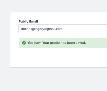
Success
Confirm successful completion of an action – like Save, Edit, or Submit – with a Success message.
<div class="comet-block-message comet-block-message--success">
    <div class="comet-block-message__icon-box">
        <svg class="comet-block-message__icon" aria-hidden="true" focusable="false">
            <use xlink:href="/comet/comet_assets/comet.svg#badge-correct"></use>
        </svg>
    </div>
    <div class="comet-block-message__content comet-long-form-text">
        <p>Your profile has been saved.</p>
    </div>
</div>
{{ comet.block_message(type="success", content="Your profile has been saved.") }}

Macro params reference
Warning
Direct attention to something undesirable that may occur using a warning message.
<div class="comet-block-message comet-block-message--warning">
    <div class="comet-block-message__icon-box">
        <svg class="comet-block-message__icon" aria-hidden="true" focusable="false">
            <use xlink:href="/comet/comet_assets/comet.svg#message-warning"></use>
        </svg>
    </div>
    <div class="comet-block-message__content comet-long-form-text">
        <p>You have not attached any resources. Resources are optional but create a stronger assessment.</p>
    </div>
</div>
{{ comet.block_message(type="warning", content="You have not attached any resources. Resources are optional but create a stronger assessment.") }}
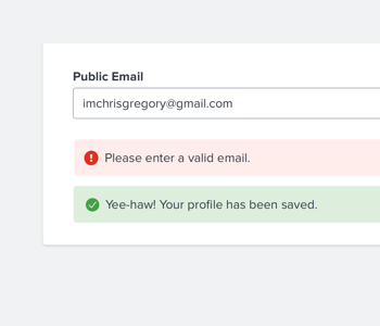
Macro params referenceError
Highlight something that went wrong – like an error, invalid entry, missing fields, or an incorrect answer – using an error message.
<div class="comet-block-message comet-block-message--error" role="alert">
    <div class="comet-block-message__icon-box">
        <svg class="comet-block-message__icon" aria-hidden="true" focusable="false">
            <use xlink:href="/comet/comet_assets/comet.svg#message-error"></use>
        </svg>
    </div>
    <div class="comet-block-message__content comet-long-form-text">
        <p>Username or password is incorrect.</p>
    </div>
</div>
{{ comet.block_message(type="error", content="Username or password is incorrect.") }}

Macro params reference
Informational
Convey additional informative messages – such as a helpful tip – that does not warrant immediate action using an informational message.
<div class="comet-block-message comet-block-message--informational">
    <div class="comet-block-message__icon-box">
        <svg class="comet-block-message__icon" aria-hidden="true" focusable="false">
            <use xlink:href="/comet/comet_assets/comet.svg#message-information"></use>
        </svg>
    </div>
    <div class="comet-block-message__content comet-long-form-text">
        <p>Students can only complete this assessment once and may not take it across multiple sittings.</p>
    </div>
</div>
{{ comet.block_message(type="informational", content="Students can only complete this assessment once and may not take it across multiple sittings.") }}

Macro params reference
Device Rotate
Inform the user that their device is in the wrong orientation with a Device Rotate Block Message.
- Never display in cases where rotating a device will not result in a proper display.
<div class="comet-block-message comet-block-message--device-rotate">
    <div class="comet-block-message__icon-box">
        <svg class="comet-block-message__icon" aria-hidden="true" focusable="false">
            <use xlink:href="/comet/comet_assets/comet.svg#device-rotate"></use>
        </svg>
    </div>
    <div class="comet-block-message__content comet-long-form-text">
        <p>This interactive is not optimized for this resolution. Rotate your device to landscape orientation or add it to your quicklist to view later on a desktop.</p>
    </div>
</div>
{{ comet.block_message(type="device-rotate", content="This interactive is not optimized for this resolution. Rotate your device to landscape orientation or add it to your quicklist to view later on a desktop.") }}

Macro params reference
With Button
A Block Message With Button displays a primary action for a user to take following message text.
<div class="comet-block-message comet-block-message--success">
    <div class="comet-block-message__icon-box">
        <svg class="comet-block-message__icon" aria-hidden="true" focusable="false">
            <use xlink:href="/comet/comet_assets/comet.svg#badge-correct"></use>
        </svg>
    </div>
    <div class="comet-block-message__content comet-long-form-text">
        <p>Your profile has been saved.</p>
    </div>
    <a class="comet-button comet-button--primary comet-button--small" role="button" href="http://www.google.com">
        View Profile
    </a>
</div>
{{ comet.block_message(type="success", content="Your profile has been saved.", cta_text="View Profile", cta_link="http://www.google.com") }}

Macro params reference
Custom Messages
For more complex messages, use the call macro to include custom in a wrapper for content other than level-4-headings and
tags.
<div class="comet-block-message comet-block-message--error" role="alert">
    <div class="comet-block-message__icon-box">
        <svg class="comet-block-message__icon" aria-hidden="true" focusable="false">
            <use xlink:href="/comet/comet_assets/comet.svg#message-error"></use>
        </svg>
    </div>
    <div class="comet-block-message__content comet-long-form-text">
        <h4>You missed some required fields.</h4>
        <ul>
            <li>Title is required.</li>
            <li>Grade is required</li>
        </ul>
    </div>
</div>
{% call comet.block_message(type="error") %}
    <h4>You missed some required fields.</h4>
    <ul>
        <li>Title is required.</li>
        <li>Grade is required</li>
    </ul>
{% endcall %}

Macro params reference
Guidelines
- Never display multiple block message variations at once.
-
use a single block message to provide user feedback.
-
use a mixture of success, warning, and error block messages that may result in a confusing experience.
- Never use a block message as “toast” or “growl” pattern messages.
Editorial
- Limit block message content to 280 characters or less.
- Use friendly, conversational language.
- Avoid jargon and language that sounds like a robot or computer speaking.
Class Reference
| Class | Applies to | Outcome |
|---|---|---|
|
|
|
Initializes an element to contain base block message styles. Must be paired with a variation. |
|
|
|
Displays informational theme for message. |
|
|
|
Displays warning theme for message. |
|
|
|
Displays error theme for message. |
|
|
|
Displays success theme for message. |
|
|
|
Displays device-rotate theme for message. |
Macro Params Reference
| Param | Default | Values | Description |
|---|---|---|---|
|
cta_link |
|
String |
The location of the link for the button |
|
cta_text |
|
String |
The text to be displayed in the button, button will not display if false |
|
class |
|
String |
Additional classes added to the block message |
|
content |
|
String |
The content to be displayed inside of a p tag in the block message |
|
header |
|
String |
The content to be displayed inside of an h4 in the block message |
|
icon_path |
|
String |
Allows the definition of an icon path for custom icons. |
|
type |
|
|
Sets the type of message. |