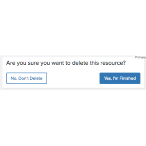
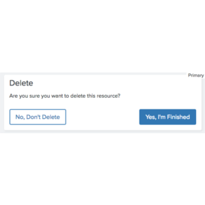
Primary Only
You can join the DE Community at any time
Click the Community butotn in the upper right. Follow the steps until you have completed all of them.
<div class="comet-dialog">
    <div class="comet-dialog__inner comet-long-form-text">
        <h3 class="comet-dialog__header">You can join the DE Community at any time</h3>
        <p class="comet-dialog__content">Click the Community butotn in the upper right. Follow the steps until you have completed all of them.</p>
    </div>
    <div class="comet-dialog__button-row">
        <button class="comet-button comet-button--primary comet-dialog__button">
            Okay
        </button>
    </div>
</div>
{{ comet.dialog(
    header="You can join the DE Community at any time",
    content="Click the Community butotn in the upper right. Follow the steps until you have completed all of them.",
    primary_cta_text="Okay"
) }}

Macro params referenceYou can join the DE Community at any time
Click the Community butotn in the upper right. Follow the steps until you have completed all of them.
Use this variation to present information that requires a user to positively confirm that they have seen the information.
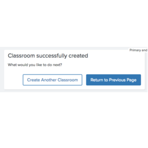
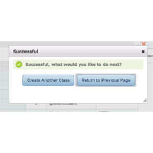
Primary and Secondary
Classroom successfully created
What would you like to do next?
<div class="comet-dialog">
    <div class="comet-dialog__inner comet-long-form-text">
        <h3 class="comet-dialog__header">Classroom successfully created</h3>
        <p class="comet-dialog__content">What would you like to do next?</p>
    </div>
    <div class="comet-dialog__button-row">
        <button class="comet-button comet-button--ghost comet-dialog__button">
            Create Another Classroom
        </button>
        <button class="comet-button comet-button--primary comet-dialog__button">
            Return to Previous Page
        </button>
    </div>
</div>
{{ comet.dialog(
    header="Classroom successfully created",
    content="What would you like to do next?",
    primary_cta_text="Return to Previous Page",
    secondary_cta_text="Create Another Classroom"
) }}

Macro params referenceClassroom successfully created
What would you like to do next?
Use when presenting with two alternative choices, and one is a primary choice. Never use a Cancel action as the secondary action.
Primary and Cancel
Would you like to join the DE Community?
<div class="comet-dialog">
    <div class="comet-dialog__inner comet-long-form-text">
        <h3 class="comet-dialog__header comet-dialog__header--no-content">Would you like to join the DE Community?</h3>
    </div>
    <div class="comet-dialog__button-row">
        <button class="comet-button comet-button--ghost comet-dialog__button comet-dialog__button--cancel js-comet-dialog__button--cancel js-comet-modal__close-button">
            Not now
        </button>
        <button class="comet-button comet-button--primary comet-dialog__button">
            Join
        </button>
    </div>
</div>
{{ comet.dialog(
    header="Would you like to join the DE Community?",
    primary_cta_text="Join",
    cancel_cta_text="Not now"
) }}

Macro params referenceWould you like to join the DE Community?
Use when presenting a single positive action and an alternative to cancel the action. Never position a Cancel button paired with a primary action on the right. Never add additional actions other than closing the dialog and returning the user to their previous state to a Cancel button.
Primary, Secondary, & Cancel
Assign to Classroom or Student?
<div class="comet-dialog">
    <div class="comet-dialog__inner comet-long-form-text">
        <h3 class="comet-dialog__header comet-dialog__header--no-content">Assign to Classroom or Student?</h3>
    </div>
    <div class="comet-dialog__button-row">
        <button class="comet-button comet-button--ghost comet-dialog__button comet-dialog__button--cancel js-comet-dialog__button--cancel js-comet-modal__close-button">
            Don't Assign
        </button>
        <button class="comet-button comet-button--ghost comet-dialog__button">
            Assign to Classroom
        </button>
        <button class="comet-button comet-button--primary comet-dialog__button">
            Assign to Student
        </button>
    </div>
</div>
{{ comet.dialog(
    header="Assign to Classroom or Student?",
    primary_cta_text="Assign to Student",
    secondary_cta_text="Assign to Classroom",
    cancel_cta_text="Don't Assign"
) }}

Macro params referenceAssign to Classroom or Student?
This variation provides the user with two actions as well as the option to cancel the action.
Guidelines
Limit display to a header, p, and between 1 and 3 buttons.
Usage
Post-Action Dialog
Use a Post-Action Dialog to confirm an action and prompt additional action(s). A Post-Action Dialog should contain a header, informational text distinct from the header, and action button(s).
-
State the action completed by the user followed by an action based question
-
Use ambiguous language in the header and repetitive language in the descriptive text
Pre-Action Dialog
A Pre-Action Dialog prompts the user to confirm an action. A Pre-Action dialog uses a header for the prompt, lacks a paragraph, and offers a confirming button on the right along with a cancelling button on the left.
-
Use descriptive wording in the header to inform the user of their action
-
Use ambiguous language in the header and repetitive language in the descriptive text
Behavior
- Minimize interruption
- Use dialogs sparingly. Dialogs are disruptive. Their sudden appearance forces users to stop their current task and focus on the dialog content. Not every choice, setting, or detail warrants interruption.
- Maintain prominence
- Never obscure dialogs by other elements or appear partially on screen. Dialogs must always retain focus until dismissed or a required action has been taken.
- Never open a subsequent dialog from a dialog.
- Fix a dialog in the middle of the viewport, separate from the underlying parent material. Dialogs should not scroll with content underneath.
- Dismiss dialogs
- Dialogs can be dismissed by touching/clicking outside of a dialog or by using the close button. Doing this cancels the action, discards any changes, and closes the dialog.
- Alternatively, dialog behavior can be overridden so that users must explicitly choose one of the actions.
- Focus Handling
- Modals should trap focus within their boundaries. See the Accessibility Guidelines for additional details.
Editorial
- Always include descriptive copy and a primary action.
- Optionally include a header and additional actions (secondary, and cancel).
Visual Style
- Display dialog boxes centered horizontally and vertically over content.
- Always use a dark overlay to provide sufficient contrast between the box and page behind it.
- Never display dialogs as inline block elements.
- Never use a reverse color scheme for dialog boxes (ie. light text on a dark background).
- Always display a primary action on the right most side, with less prominent actions to its left.
- Always display cancel on the far left, visually separated from positive actions
Class Reference
| Class | Applies to | Outcome |
|---|---|---|
|
|
|
Applies base styles to dialog. |
|
|
|
Applies styles to button row container. |
|
|
|
Applies dialog specific rules to comet buttons. |
|
|
|
Applies cancel specific rules to dialog button. |
Macro Reference
| Parameter | Default | Values | Description |
|---|---|---|---|
|
header |
|
String |
The content to be displayed inside of an h4 in the dialog |
|
content |
|
String |
The content to be displayed inside of a p tag in the dialog |
|
primary_cta_link |
|
url |
Url for primary cta |
|
primary_cta_text |
|
String |
Text for primary cta |
|
primary_cta_type |
|
Button Types |
Primary cta button type |
|
secondary_cta_link |
|
url |
Url for secondary cta |
|
secondary_cta_text |
|
String |
Text for secondary cta |
|
secondary_cta_type |
|
Button Types |
Secondary cta button type |
|
cancel_cta_text |
|
String |
Text for cancel cta |
|
cancel_cta_type |
|
Button Types |
Cancel cta button type |
|
class |
|
String |
Additional classes added to the dialog |
|
id |
|
String |
Id of the dialog |