Default
Trigger a popover using the click or focus event, which positions the popover below the target element by default.
<button class="comet-button comet-button--ghost comet-popover-trigger js-comet-popover-trigger " data-comet-popover="comet-popover-37547" aria-describedby="comet-popover-37547" haspopup="true">Click to Open Popover</button>
<div class="comet-popover comet-popover--bottom " id="comet-popover-37547">
    <div class="comet-popover__nub"></div>
    Popovers are triggered by click and focus by default.
</div>
Positioned
Position a popover using a modifier class, such as comet-popover--top. The nub will always point to the center of the element, but the popover can shift vertically or horizontally. Without a modifier, popovers default to comet-popover--bottom
The most common variations are left, top, bottom, and right.
These are some common popover positions.
These are some common popover positions.
These are some common popover positions.
These are some common popover positions.
<button class="comet-button comet-button--ghost comet-popover-trigger js-comet-popover-trigger " data-comet-popover="comet-popover-37595" aria-describedby="comet-popover-37595" haspopup="true">Left</button>
<div class="comet-popover comet-popover--left " id="comet-popover-37595">
    <div class="comet-popover__nub"></div>
    <p>These are some common popover positions.</p>
</div> <button class="comet-button comet-button--ghost comet-popover-trigger js-comet-popover-trigger " data-comet-popover="comet-popover-8556" aria-describedby="comet-popover-8556" haspopup="true">Top</button>
<div class="comet-popover comet-popover--top " id="comet-popover-8556">
    <div class="comet-popover__nub"></div>
    <p>These are some common popover positions.</p>
</div> <button class="comet-button comet-button--ghost comet-popover-trigger js-comet-popover-trigger " data-comet-popover="comet-popover-28552" aria-describedby="comet-popover-28552" haspopup="true">Bottom</button>
<div class="comet-popover comet-popover--bottom " id="comet-popover-28552">
    <div class="comet-popover__nub"></div>
    <p>These are some common popover positions.</p>
</div> <button class="comet-button comet-button--ghost comet-popover-trigger js-comet-popover-trigger " data-comet-popover="comet-popover-58111" aria-describedby="comet-popover-58111" haspopup="true">Right</button>
<div class="comet-popover comet-popover--right " id="comet-popover-58111">
    <div class="comet-popover__nub"></div>
    <p>These are some common popover positions.</p>
</div>
Shifted
Shift top and bottom variations to the right or left by adding -right or -left to the modifier classes, respectively.
These popovers are horizontally shifted.
These popovers are horizontally shifted.
These popovers are horizontally shifted.
These popovers are horizontally shifted.
<button class="comet-button comet-button--ghost comet-popover-trigger js-comet-popover-trigger " data-comet-popover="comet-popover-5896" aria-describedby="comet-popover-5896" haspopup="true">Top left</button>
<div class="comet-popover comet-popover--top-left " id="comet-popover-5896">
    <div class="comet-popover__nub"></div>
    <p>These popovers are horizontally shifted.</p>
</div> <button class="comet-button comet-button--ghost comet-popover-trigger js-comet-popover-trigger " data-comet-popover="comet-popover-59208" aria-describedby="comet-popover-59208" haspopup="true">Top right</button>
<div class="comet-popover comet-popover--top-right " id="comet-popover-59208">
    <div class="comet-popover__nub"></div>
    <p>These popovers are horizontally shifted.</p>
</div> <button class="comet-button comet-button--ghost comet-popover-trigger js-comet-popover-trigger " data-comet-popover="comet-popover-20624" aria-describedby="comet-popover-20624" haspopup="true">Bottom left</button>
<div class="comet-popover comet-popover--bottom-left " id="comet-popover-20624">
    <div class="comet-popover__nub"></div>
    <p>These popovers are horizontally shifted.</p>
</div> <button class="comet-button comet-button--ghost comet-popover-trigger js-comet-popover-trigger " data-comet-popover="comet-popover-32250" aria-describedby="comet-popover-32250" haspopup="true">Bottom right</button>
<div class="comet-popover comet-popover--bottom-right " id="comet-popover-32250">
    <div class="comet-popover__nub"></div>
    <p>These popovers are horizontally shifted.</p>
</div>
Shift left and right variations to the top or bottom by adding -top or -bottom to the modifier classes, respectively.
These popovers are vertically shifted.
These popovers are vertically shifted.
These popovers are vertically shifted.
These popovers are vertically shifted.
<button class="comet-button comet-button--ghost comet-popover-trigger js-comet-popover-trigger " data-comet-popover="comet-popover-58319" aria-describedby="comet-popover-58319" haspopup="true">Left top</button>
<div class="comet-popover comet-popover--left-top " id="comet-popover-58319">
    <div class="comet-popover__nub"></div>
    <p>These popovers are vertically shifted.</p>
</div> <button class="comet-button comet-button--ghost comet-popover-trigger js-comet-popover-trigger " data-comet-popover="comet-popover-90275" aria-describedby="comet-popover-90275" haspopup="true">Left bottom</button>
<div class="comet-popover comet-popover--left-bottom " id="comet-popover-90275">
    <div class="comet-popover__nub"></div>
    <p>These popovers are vertically shifted.</p>
</div> <button class="comet-button comet-button--ghost comet-popover-trigger js-comet-popover-trigger " data-comet-popover="comet-popover-35078" aria-describedby="comet-popover-35078" haspopup="true">Right top</button>
<div class="comet-popover comet-popover--right-top " id="comet-popover-35078">
    <div class="comet-popover__nub"></div>
    <p>These popovers are vertically shifted.</p>
</div> <button class="comet-button comet-button--ghost comet-popover-trigger js-comet-popover-trigger " data-comet-popover="comet-popover-18730" aria-describedby="comet-popover-18730" haspopup="true">Right bottom</button>
<div class="comet-popover comet-popover--right-bottom " id="comet-popover-18730">
    <div class="comet-popover__nub"></div>
    <p>These popovers are vertically shifted.</p>
</div>
Show With Custom Event
You can display or hide a popover at any time by triggering show and hide events.
Now you can type "h" to hide me.
<input type="text" class="comet-form__input js-custom-event-trigger" placeholder="type s to show and h to hide" />
<div class="comet-popover comet-popover--bottom" id="custom-event-triggered">
    <div class="comet-popover__nub"></div>
    <p>Now you can type "h" to hide me.</p>
</div>
$(".js-custom-event-trigger").on("keyup", function(event) {
    var sKeyCode = 83;
    var hKeyCode = 72;
    var $popover = $(".comet-popover#custom-event-triggered");

    if (event.which === sKeyCode) {
        // el specifies the target element
        $popover.trigger("show", { "el": this });
    } else if (event.which === hKeyCode) {
        $popover.trigger("hide");
    }
});
Show on Hover
You can display popovers when a user hovers over a target element.
Popovers can also be triggered on hover
<button class="comet-button comet-button--ghost comet-popover-trigger js-comet-popover-trigger " data-comet-popover="comet-popover-35051" aria-describedby="comet-popover-35051" data-comet-popover-event="hover" haspopup="true">Hover to Show Popover</button>
<div class="comet-popover comet-popover--bottom " id="comet-popover-35051">
    <div class="comet-popover__nub"></div>
    <p>Popovers can also be triggered on hover</p>
</div>
Combined with Tooltips
A target element can show a tooltip first on hover, and then a popover on click. Add the comet-tooltip and js-comet-tooltip-trigger classes and the data-comet-tooltip-text attribute to the target element to add a toolitp. More information on tooltips is available on the Tooltips page.
And here is a lot more text when you click on the button.
<button class="comet-button comet-button--ghost comet-popover-trigger js-comet-popover-trigger comet-tooltip comet-tooltip--bottom js-comet-tooltip-trigger" data-comet-popover="comet-popover-36006" aria-describedby="comet-popover-36006" data-comet-tooltip-text="Here is a little text." haspopup="true">Hover then Click</button>
<div class="comet-popover comet-popover--bottom " id="comet-popover-36006">
    <div class="comet-popover__nub"></div>
    <p>And here is a lot more text when you click on the button.</p>
</div>
Without Inset
Popovers have an inset padding of 16px by default. Add comet-popover--no-inset-padding to remove.
<button class="comet-button comet-button--ghost comet-popover-trigger js-comet-popover-trigger " data-comet-popover="comet-popover-68475" aria-describedby="comet-popover-68475" haspopup="true">No inset padding</button>
<div class="comet-popover comet-popover--bottom comet-popover--no-inset-padding" id="comet-popover-68475">
    <div class="comet-popover__nub"></div>
    <img src="/images/components/popovers/comet.jpg" />
</div>
Guidelines
- Add
overflow: autoto the popover if it contains content with a large height (i.e. a List Group) to add a scroll bar. - Apply text styles and internal spacing to content within a popover as needed.
- Add the
aria-describedbyattribute to the target element for accessibility. - Popover triggers should have the
haspopup=trueproperty for assistive technology functionality.
Use When
- Displaying content associated with a particular element
Don’t Use When
- Displaying a single line of text. Use Tooltips instead
- Drawing attention to large amounts of content that require immediate attention. Use a modal instead.
Interaction
- Popovers dismiss when there is a click anywhere outside the popover, when the target element blurred, or when the ESC key is pressed.
- Popovers dismiss when another popover is opened.
- Show only one popover on the page at a time.
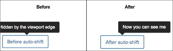
Popovers adapt automatically to attempt to display fully visibly in the viewport. If a popover with the comet-popover--top variation is cut off by the top of the viewport, it will automatically appear as comet-popover--bottom.
I can shift to the bottom of the target element.
<button class="comet-button comet-button--ghost comet-popover-trigger js-comet-popover-trigger " data-comet-popover="comet-popover-50054" aria-describedby="comet-popover-50054" haspopup="true">Scroll to top</button>
<div class="comet-popover comet-popover--top " id="comet-popover-50054">
    <div class="comet-popover__nub"></div>
    <p>I can shift to the bottom of the target element.</p>
</div>
Similarly, if a comet-popover--top or comet-popover--bottom overflows the side of the viewport, the popover automatically shifts to to a horizontally shifted variation.
Class Reference
| Class | Applies to | Outcome |
|---|---|---|
|
|
Any element |
Base styles for popover. |
|
|
Any element |
Establishes element as target element that popover is directed at. |
|
|
|
Makes the popover trigger functional with JavaScript. |
|
|
|
Displays popover centered above target element. |
|
|
|
Displays popover centered below target element. |
|
|
|
Displays popover centered to the left of the target element. |
|
|
|
Displays popover centered to the right of the target element. |
|
|
|
Displays popover above the target element and shifted right. |
|
|
|
Displays popover above the target element and shifted left. |
|
|
|
Displays popover below the target element and shifted right. |
|
|
|
Displays popover below the target element and shifted left. |
|
|
|
Displays popover to the left of the target element and shifted up. |
|
|
|
Displays popover to the left of the target element and shifted down. |
|
|
|
Displays popover to the right of the target element and shifted up. |
|
|
|
Displays popover to the right of the target element and shifted down. |
|
|
|
Displays popover with no inset padding. |
|
|
|
Displays popover that is more visible on a dark background. |
Script Reference
- Popovers are automatically activated on
$(document).ready(). - Call
Comet.Popovers.initialize()to activate popovers added after the page loads. showandhideevents are debounced. If an event is fired immediately after another, it will be ignored.