Inset
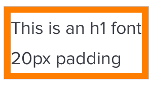
An inset is the space within a block from which elements —typography, images, icons, and more — are separated from the edge. By default, a component’s inset should be equal on all four sides.
Examples
 Figure: Button, using
 $space-inset-default
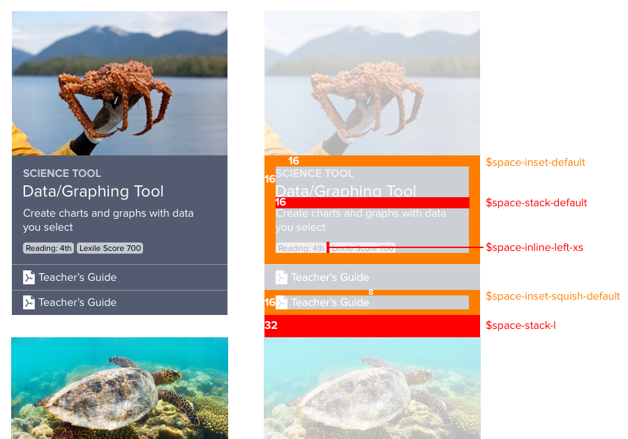
 Figure: Card title/description block, using
 $space-inset-default
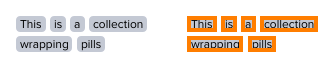 Figure: Pill, using
 $space-inset-xs
Variables
Apply an inset variable token to the padding property.
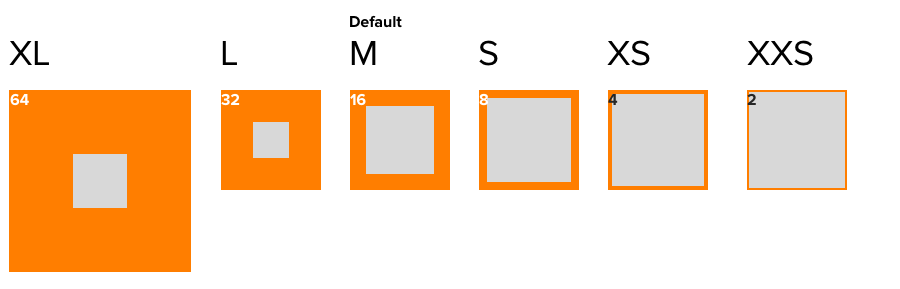
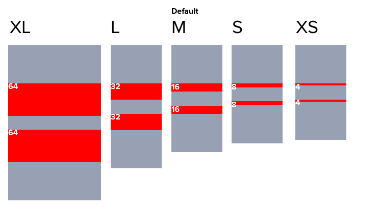
| Variable Name | Value |
|---|---|
$comet-space-inset-default |
16px 16px 16px 16px |
$comet-space-inset-xxs |
2px 2px 2px 2px |
$comet-space-inset-xs |
4px 4px 4px 4px |
$comet-space-inset-s |
8px 8px 8px 8px |
$comet-space-inset-m |
16px 16px 16px 16px |
$comet-space-inset-l |
32px 32px 32px 32px |
$comet-space-inset-xl |
64px 64px 64px 64px |
Squish Inset
A squish inset reduces top and bottom padding by 50% relative to the default inset space.
Use When
- Compressing toolbar options
- Stacking list or menu options
Examples
 Figure: Small button, using
 $space-inset-squish-default
 Figure: Footer options, with
 $space-inset-squish-default
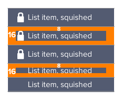 Figure: Stacked icon/label pairs as options, with
 $space-inset-squish-default
Variables
| Variable Name | Value |
|---|---|
$comet-space-inset-squish-default |
8px 16px 8px 16px |
$comet-space-inset-squish-xs |
2px 4px 2px 4px |
$comet-space-inset-squish-s |
4px 8px 4px 8px |
$comet-space-inset-squish-m |
8px 16px 8px 16px |
$comet-space-inset-squish-l |
16px 32px 16px 32px |
Stretch Inset
A stretched inset increases top and bottom padding by 50% relative to the default inset space.

Use When
- Inputting text input
Examples
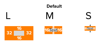
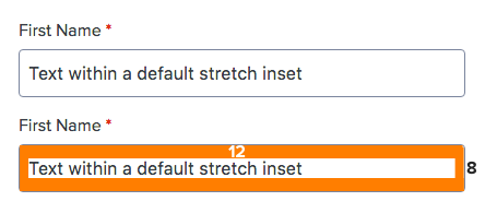 Figure: Textbox stretch inset, using
 $space-inset-stretch-s
Variables
Apply a stretch inset variable token to the padding property.
| Variable Name | Value |
|---|---|
$comet-space-inset-stretch-default |
24px 16px 24px 16px |
$comet-space-inset-stretch-s |
12px 8px 12px 8px |
$comet-space-inset-stretch-m |
24px 16px 24px 16px |
$comet-space-inset-stretch-l |
48px 32px 48px 32px |
Stacking
Use a stacking value to separate block components arranged vertically in a column. The last component in a stack should omit this space.
Variables
Apply stacking variables to the margin property.
| Variable Name | Value |
|---|---|
$comet-space-stack-default |
0 0 16px 0 |
$comet-space-stack-xs |
0 0 4px 0 |
$comet-space-stack-s |
0 0 8px 0 |
$comet-space-stack-m |
0 0 16px 0 |
$comet-space-stack-l |
0 0 32px 0 |
$comet-space-stack-xl |
0 0 64px 0 |
Inline
Use inline spacing variable tokens to separate inline elements arranged horizontally and that may wrap on the right. The last component in an inline set should omit this space.
Examples
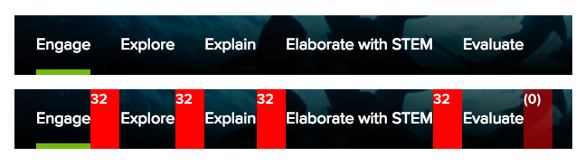 Figure: Techbook Concept tabs separated using
 $space-inline-left-l
 Figure: Pills separated using
 $space-inline-left-xs
Variables
Apply inline spacing variables to the margin property.
| Variable Name | Value |
|---|---|
$comet-space-inset-default |
16px 16px 16px 16px |
$comet-space-inset-xxs |
2px 2px 2px 2px |
$comet-space-inset-xs |
4px 4px 4px 4px |
$comet-space-inset-s |
8px 8px 8px 8px |
$comet-space-inset-m |
16px 16px 16px 16px |
$comet-space-inset-l |
32px 32px 32px 32px |
$comet-space-inset-xl |
64px 64px 64px 64px |
How to Use
Spacing rules for insets, stacks, and inline elements are applied to all system components. You can also apply these conventions using available variables.
When variables conflict with product constraints such as fixed markup, we suggest that you first apply a space convention to your component or element, then override when necessary. This will sustain a visible, traceable relationship with the system’s model.
For example, suppose you have an existing Card component built as three stacked internal elements rather than one stack of all three together.
Custom Markup & Style
If coding following system conventions like BEM notation and tokens, your markup and style would be:
Applying Style to Fixed Markup
However, due to project constraints, you may be unable to change component markup and will apply system choices to style only. To apply inset and stack spacing, you could:
Generic Variables
Avoid using generic space variables in favor of more specific options such as inset, squish, stretch, stack, and inline options described above.
However, when established concepts don’t meet your needs – or you are overriding or extending a concept for a special case – use these recognizable, generic variables to persist spatial concepts and maintenance in code.
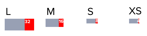
| Variable Name | Value |
|---|---|
$comet-space-default |
16px |
$comet-space-xxs |
2px |
$comet-space-xs |
4px |
$comet-space-s |
8px |
$comet-space-m |
16px |
$comet-space-l |
32px |
$comet-space-xl |
64px |
Vertical Text Crop Mixin
Use the vertical-text-crop() mixin to remove unwanted whitespace at the top and bottom of elements that contain text.

Example
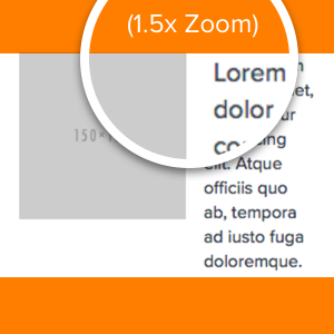
Without the mixin, text renders with full em-block, causing “extra” space on top and bottom
With the mixin, whitespace is cropped to cap-height on top and baseline on bottom
Use When
- Improve the visual consistency of any component with strict text alignment
- Vertically aligning heterogeneous objects, especially text and images
- Vertically aligning text within an element
-

use this mixin to align text and images to a common “caps height” and “baseline”.
-
create component-specific shims or negative margins to accomplish vertical alignment.
Usage
Avoid using the mixin frivolously. Include it when a component has text alignment issues.
The mixin should only be used on elements that contain text directly. Nesting will cause issues.
DO
<p class=”my-text-element”>
	Lorem ipsum dolor..
</p>
.my-text-element {
	vertical-text-crop();
}
DON’T
<div class=”wrapper-element”>
	<p class=”my-text-element”>
		Lorem ipsum dolor..
	</p>
	<img class=”my-image” src=”http…”/>
</div>
.wrapper-element {
	vertical-text-crop();
	// mixin will not crop the correct amount of white space
}
By default the mixin assumes Comet’s default line-height, font-family, font-weight, and font-style. If the element using the mixin is not using these font property defaults, then the mixin must be configured. Without this configuration, the mixin will not crop the correct amount of whitespace.
DO
.my-text-element {
	vertical-text-crop(
		$line-height: $comet-font-line-height-s,
			$font-weight: ‘bold’,
	  		$font-family: $comet-font-family-serif);
	  	font-weight: bold;
	  	font-family: $comet-font-family-serif;
	  	line-height: $comet-font-line-height-s;
}
DON’T
.my-text-element {
	vertical-text-crop();
	font-weight: bold;
	font-family: $comet-font-family-serif;
	line-height: $comet-font-line-height-s;
	// mixin will not crop the correct amount of white space
}
Mixin Params Reference
| Mixin arguments | Possible values |
|---|---|
|
|
|
|
|
|
|
|
|
|
|
|
The mixin contains presets that support all of Comet’s font families, weights and styles.